
Trends in graphic design come and go, and as we reported last year, the 2020s are marking a shift away from the flat design and minimalist aesthetics of the 2010s toward a more maximalist approach.
As a result, many brand logos are morphing from flatter, 2D images to incorporate subtle elements of depth design.
Regardless of current trends, learning depth design techniques is a great way to uplevel your design work.
Depth in design refers to the use of design elements to create an illusion of three-dimensionality. It can spark visual interest and create a sense of realism that draws the viewer in.
It can also create a sense of hierarchy in the composition and guide the viewer toward the main point of focus (for example, a call to action). In web design, adding depth can elevate a website design and improve user experience.
This article will cover the most important depth design techniques, examples to inspire you, and why mastering depth in design matters.
6 ways to create depth in graphic design
Use the following six techniques to give your designs more depth.
1. Overlapping elements
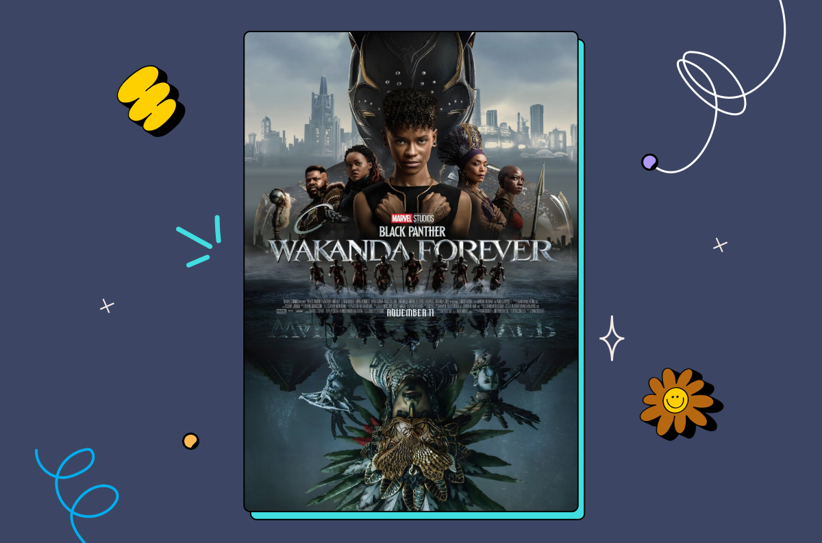
Overlapping objects means placing one design element in front of another, which can create the illusion of depth.
This technique works especially well when the elements are slightly transparent, allowing the element behind to show through and adding to the sense of depth.
For example, in a poster design, the main image of a person could overlap smaller images of supporting characters and text, creating a sense of depth and hierarchy — like in this Wakanda Forever poster:
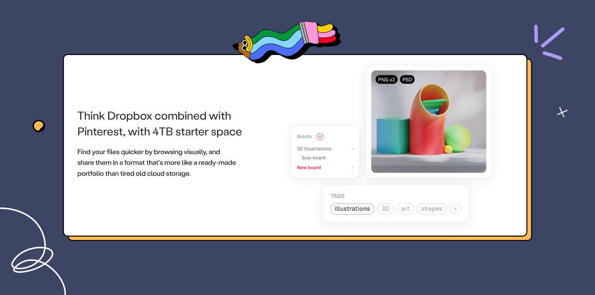
2. Shading and highlighting
Adding shading to objects — known as drop shadows — can give the impression of form and depth, while highlighting can suggest the presence of light and add to the sense of three-dimensionality.
This technique is often used in illustration and product design to create a sense of depth and realism or to highlight a particular design element.
For example, on the Playbook website, we use subtle shading effects to draw the viewer’s eye to specific elements:
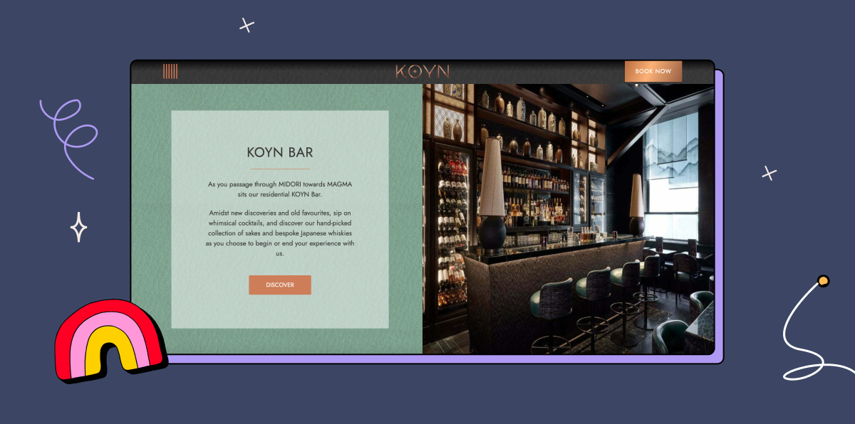
3. Size and placement
Use sizing and placement to emulate the way we see things in 3D — objects that are larger or closer appear to be in the foreground, while smaller or farther away objects recede into the background. Effective use of size and placement can add to the sense of depth and hierarchy in the composition.
For example, in a website layout, the main content area could be larger and in the foreground, while the sidebar with additional links and information is smaller and recedes into the background.
London-based restaurant KOYN’s website plays with these elements by showing attractive photos of the restaurant and bar beside blocks of text that draw the viewer’s eye toward a call to action:
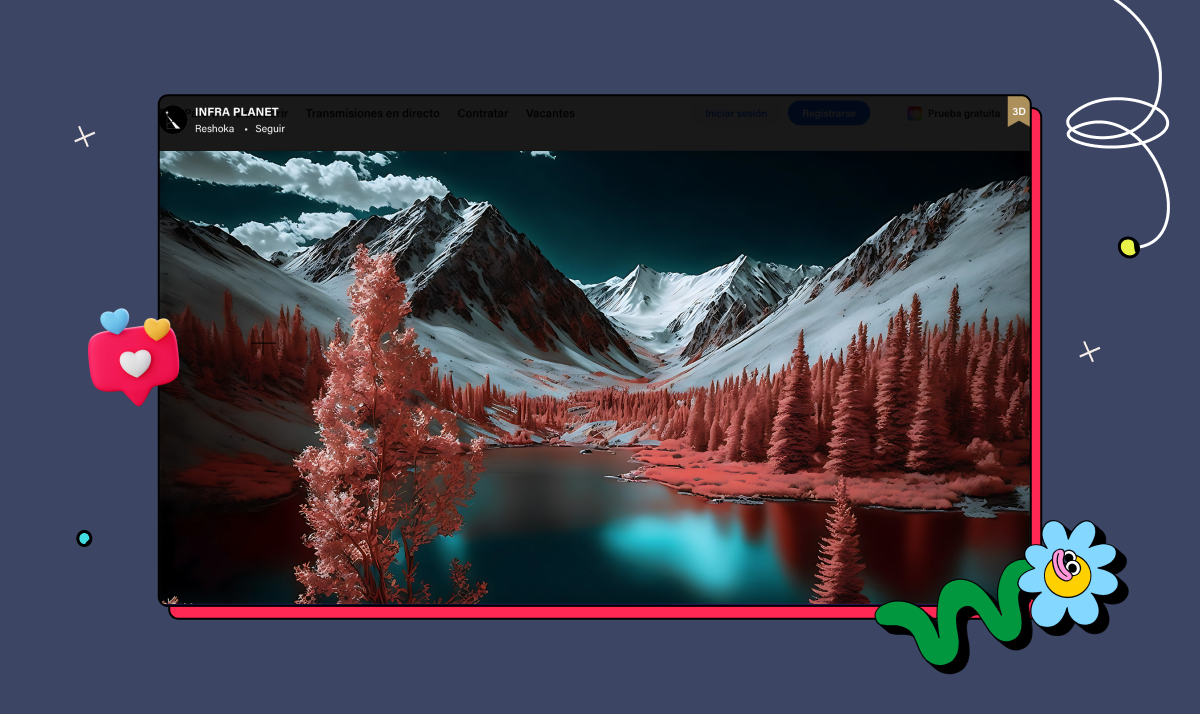
4. Color and value
Using color and value contrast can also create depth, with warmer colors appearing closer and cooler colors receding. This technique works particularly well when combined with others, such as overlapping and shading.
In a landscape illustration, for example, the mountains in the background could be depicted with cooler, more muted colors, while the foreground elements, such as the grass and trees, are warmer and more vibrant — just like this piece by digital artist Reshoka on Behance:
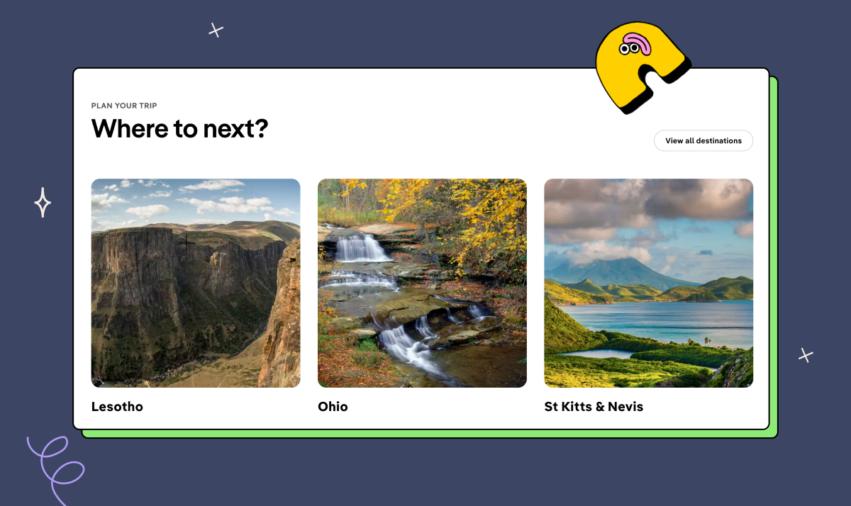
5. Depth of field
Using selective focus in photography or illustration can create different depths by having some elements in focus while others are blurred. Use this technique to draw attention to a specific part of the composition and create a sense of depth.
Check out these examples from the Lonely Planet website:
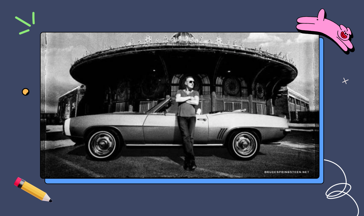
6. Perspective
Using linear or atmospheric perspective can create depth by depicting objects as they would appear at a distance, with converging lines and less distinct detail.
This technique is often used in architecture and landscape design but can also be effective in other types of design.
For example, in a poster for a concert, the stage could be depicted using perspective to create a sense of depth and looking into the scene.
The photo below is from Bruce Springsteen’s 2023 tour poster. Notice how all the shadows, highlights, and lines seem to converge, making The Boss the central focal point of the image:
Top examples of the use of depth in design
Looking for more depth design inspiration? Here are three of the most recognizable examples of logos, posters, and other graphics that make an impact through their use of depth.
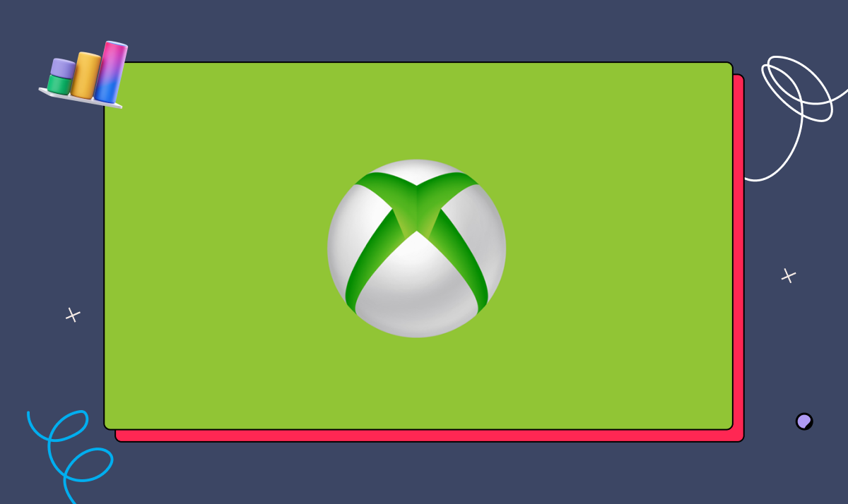
1. The Xbox logo(s)
The Xbox console logos have always created a solid illusion of depth, making a flat circle look like a futuristic white-and-green ball with the iconic ‘X’ embedded in it.
Take the Xbox One logo: it uses color, contrast, and placement of the X (making it slightly off-center) to create the illusion of a sphere with a profound green chasm.
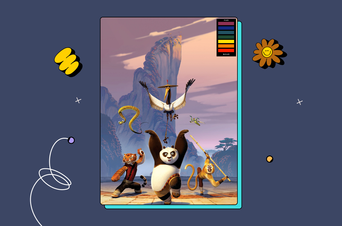
2. The Kung Fu Panda movie poster
Creating an impactful movie poster is no easy task. One dilemma for designers might be how to draw the viewer’s eyes to what they want to highlight while juggling all the assets the marketing team needs them to include. Learning how to use depth well — for example, with color and perspective — can go a long way in solving this predicament.
The Kung Fu Panda movie poster below foregrounds warm colors, such as orange and red, around the main cast of characters, and drapes the background in cooler shades of blue, grey, and mauve, to make the protagonists appear to pop out of a 2D environment.
3. The New York Times magazine
Finally, if you want a masterclass in using single-point perspective to create depth, look no further than this issue of the New York Times magazine, featuring a Cadillac and some striking depth wizardry:
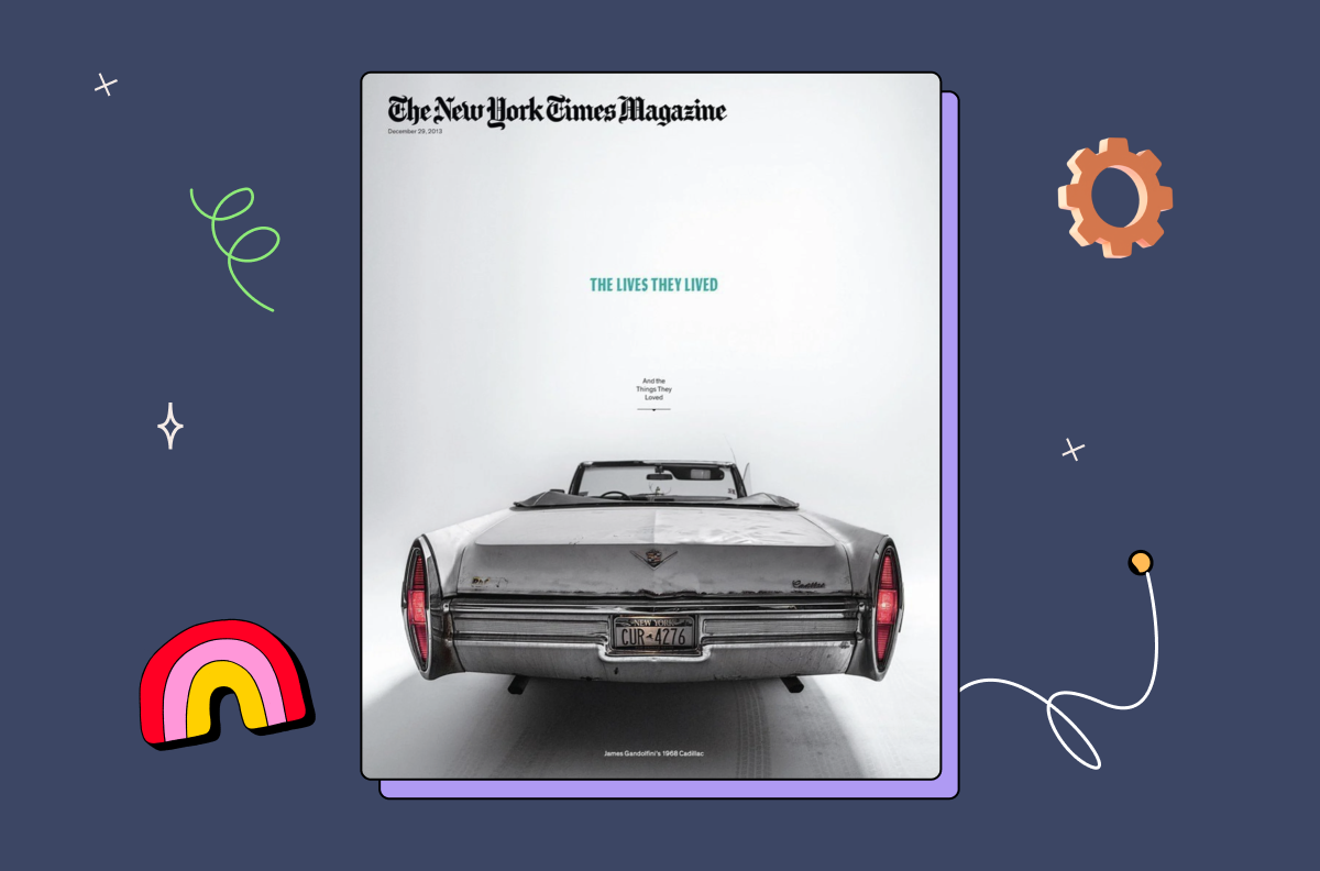
The trunk of the car is in glaring focus, with the length exaggerated to emphasize its closeness to the viewer’s eyes and the windshield and bonnet practically vanishing into a single point.
These elements all add up to an image you can’t easily forget and, more importantly, one that gets you to open the magazine.
Why do you need to master depth in graphic design?
You might be wondering whether it’s really worth the effort involved in upskilling yourself and adding more depth to your designs.
The short answer is — yes.
While depth may seem like a straightforward design element, mastering a few depth design fundamentals can make a significant difference in how your design looks and feels.
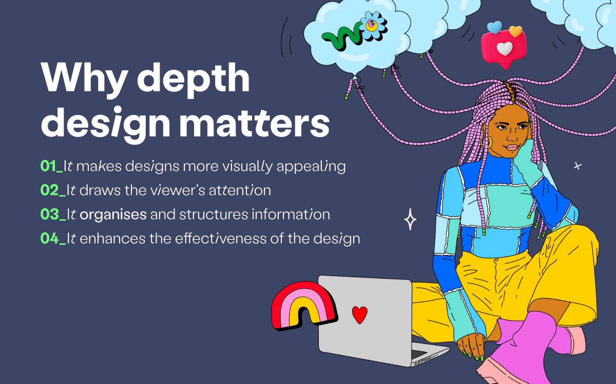
Here are four of the main ways incorporating depth can improve your graphic design projects.
1. It makes designs more visually appealing
By creating the illusion of depth, you can give your designs a sense of dimensionality that makes them more interesting to look at. Depth makes a design come alive and look more realistic.
2. It draws the viewer’s attention
Creating the illusion of depth can help draw the viewer’s eye into the design, catch their attention, and focus on specific elements.
3. It organizes and structures information
Using depth skillfully can make your design easier to understand. Visual information is still information, and too much of it, presented with no apparent hierarchy, can be overwhelming. Depth solves this problem by clarifying what’s important and needs to be taken in first.
4. It enhances the effectiveness of the design
By using depth, you can create designs that communicate the message more effectively, helping achieve its ultimate goal.
When information is broken down and presented in a helpful order, it naturally guides the viewer toward the decision you want them to consider.
Bring your designs to life with depth design
Now it’s time to put everything you’ve learned into action. Play around and practice using the techniques outlined above to create more depth in your design work.
Experimenting with these different techniques can lead to more exciting and compelling designs and take your design career to the next level.
It will be great for your graphic design portfolio — plus, your clients will love you for it!
If you’re looking for more resources that will help you build your design skills, check out our article on ways to boost your creativity as a designer.
Interested in learning everything important about using space in graphic design? Our Ultimate Guide has you covered. Hit the button below to go right to it.