TYPOGRAPHY
Amplify Typeface
Amplify Typeface
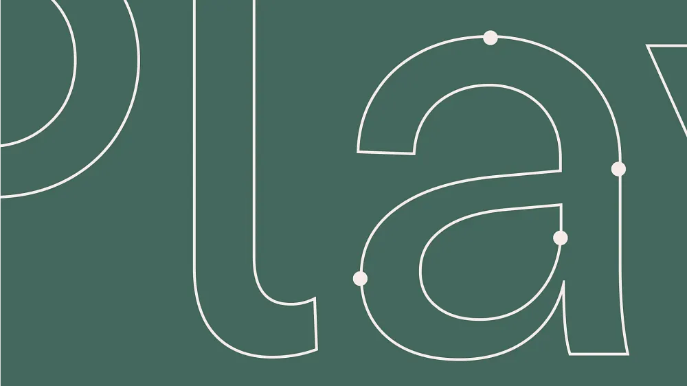
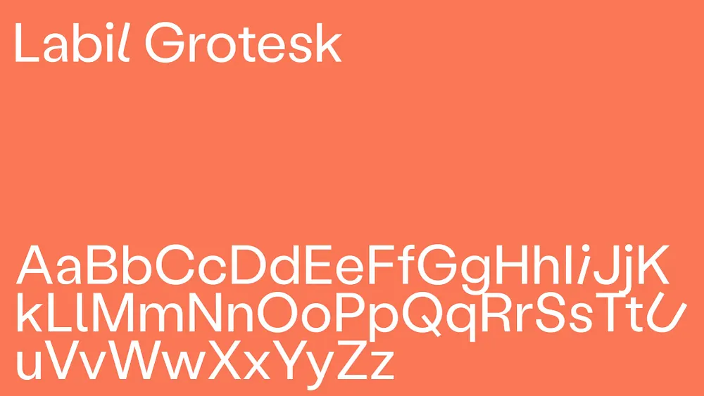
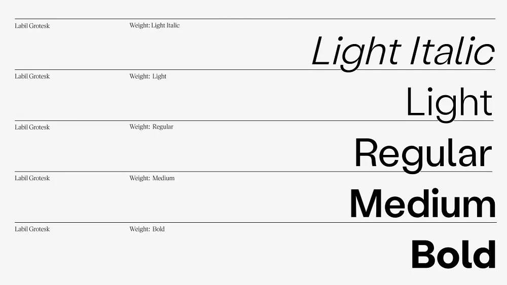
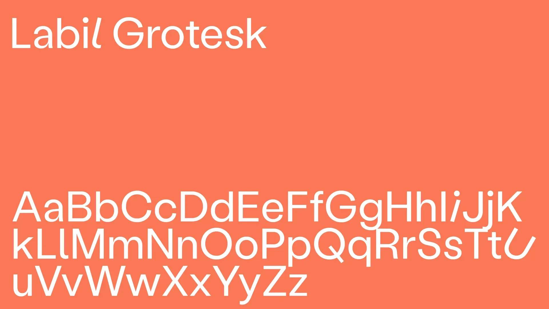
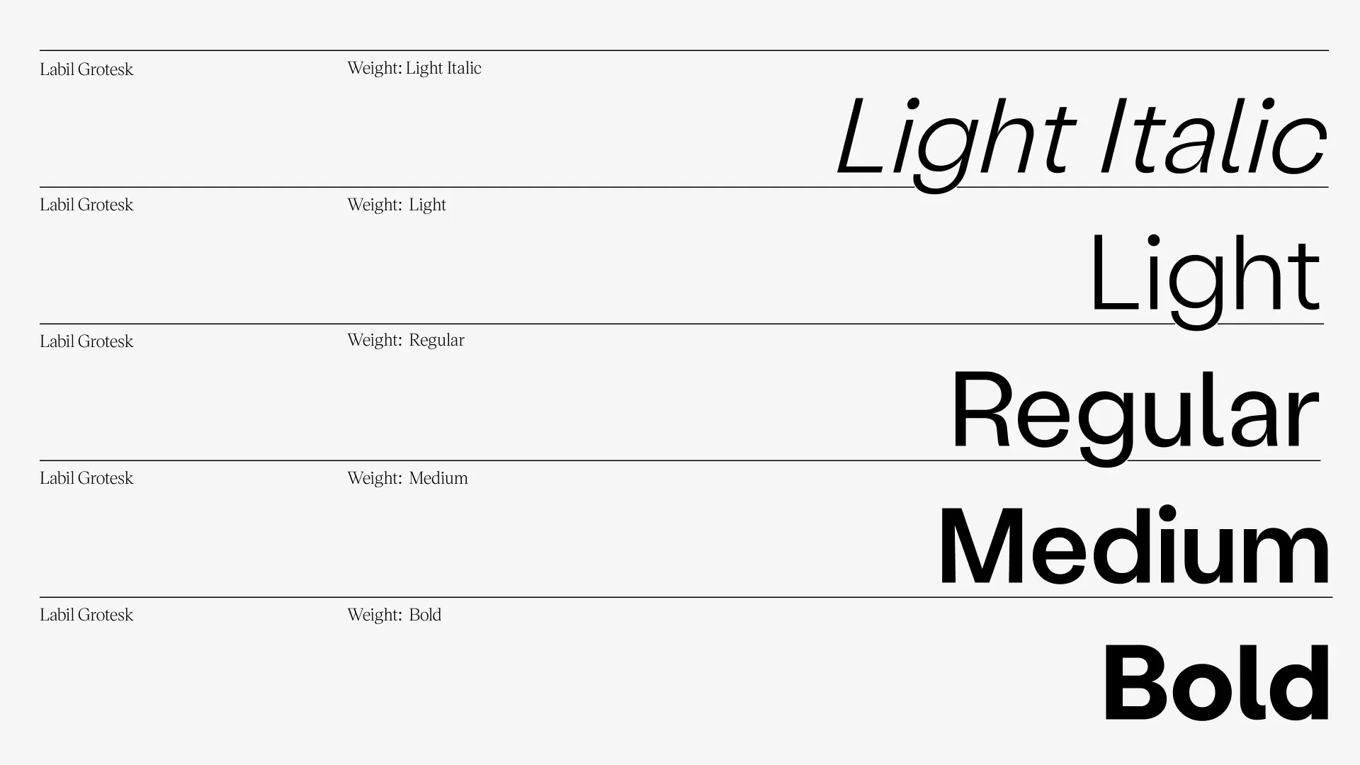
We use Labil Grotesk Light in most applications, from headlines, to body copy, and bulleted text.
In the special case of short hero headlines, we can use up to one instance of our slanted O (or double OO) glyph to emphasize a word. This adds another level of brand recognition and quirk.
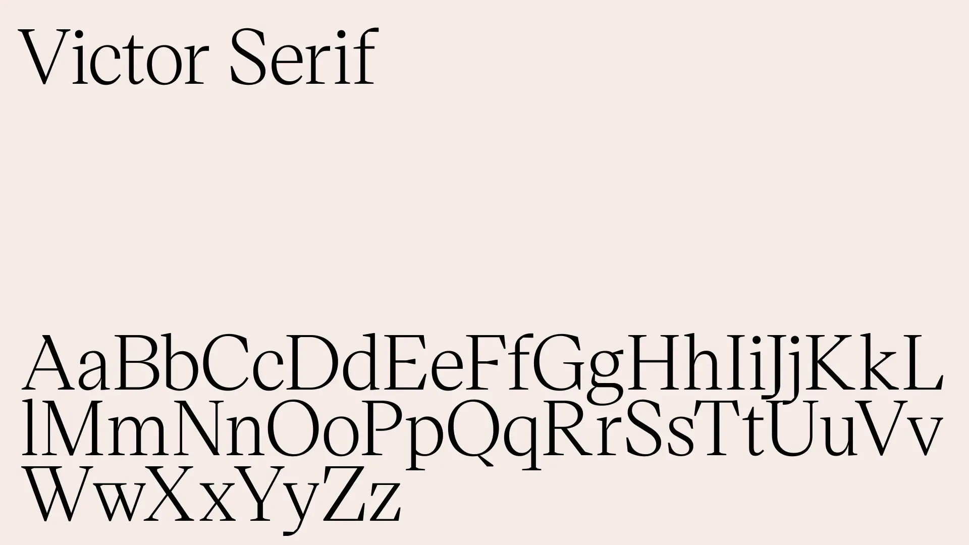
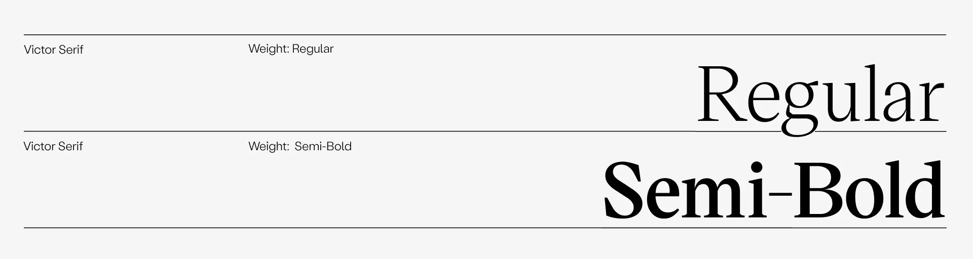
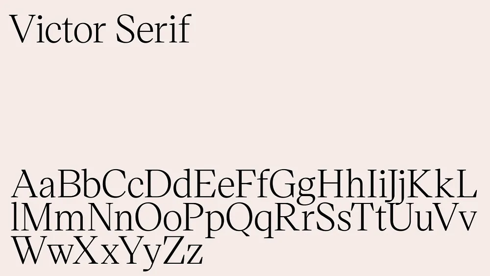
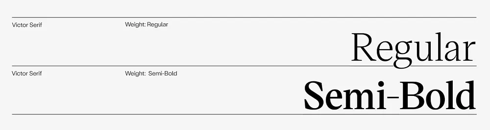
We use Victor Serif Regular for the occasional pop of contrasts, technical headlines, technical call-outs, CTAs and some hero links.