VISUAL IDENTITY

Visualizing the Brand
Playbook exists to give creative work the home it deserves. Not just a place to store files, but a visual center of gravity—a clean, intuitive space where ideas connect across timelines, teams, and tools. This home is designed to reflect the quality of the work it holds: inspiring, precise, and crafted with care. Whether you’re an independent artist or part of a global brand, Playbook helps you find, share, and build on creative work with clarity and ease.
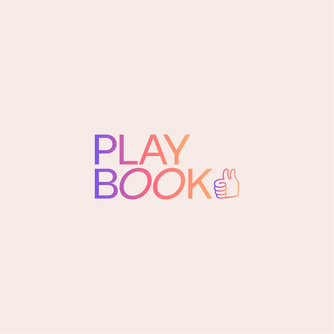
Our brand is an extension of that belief. The double thumbs-up symbol anchors our identity—it’s familiar, utilitarian, and affirming. Paired with our wordmark’s slanted O’s, it reflects momentum and play, striking a balance between stability and quirk. Together, they signal our promise: to support creative work at every scale with the thoughtfulness it deserves.
Our color palette leads with Punch Red—bold, expressive, and energetic—grounded by Neutral tones and elevated with accents like Aqua, Yellow, and Purple. It’s a system that captures both confidence and creativity. We use Labil Grotesk as our primary typeface—a sans-serif with subtle eccentricity—and Victor Serif for moments of refinement. The typography is airy, intentional, and easy to read—always leaving room for the work to shine.
We don’t chase trends or scream for attention. We build deliberately, iterate constantly, and let the product speak. Our brand reflects that: polished yet playful, high-performing yet warm. Because at Playbook, we’re not just designing storage—we’re designing a platform worthy of the world’s best creative work.
DISCOVER PLAYBOOK