

As a graphic designer, color is arguably the most important element of your designs — without color, they wouldn’t exist at all.
Of course, our perception of color is just the way our brains interpret the different frequencies of light that enter our eyes as it reflects off objects.
For example, if I ask you what color a tomato is, you would probably say red. But in reality, when you look at the tomato, you actually see a bunch of different colors that your brain consolidates into what it calls red.
These optical illusions give designers a lot to play with. To work with color successfully in your designs and create the desired effect — whether it’s a playful new brand logo or a professional-looking website design — you need to understand relative and absolute colors and the different ways you can use them.
Today, we’re going to cover the basics of relative and absolute colors, so let’s dive in!
The difference between relative color and absolute color
Relative colors
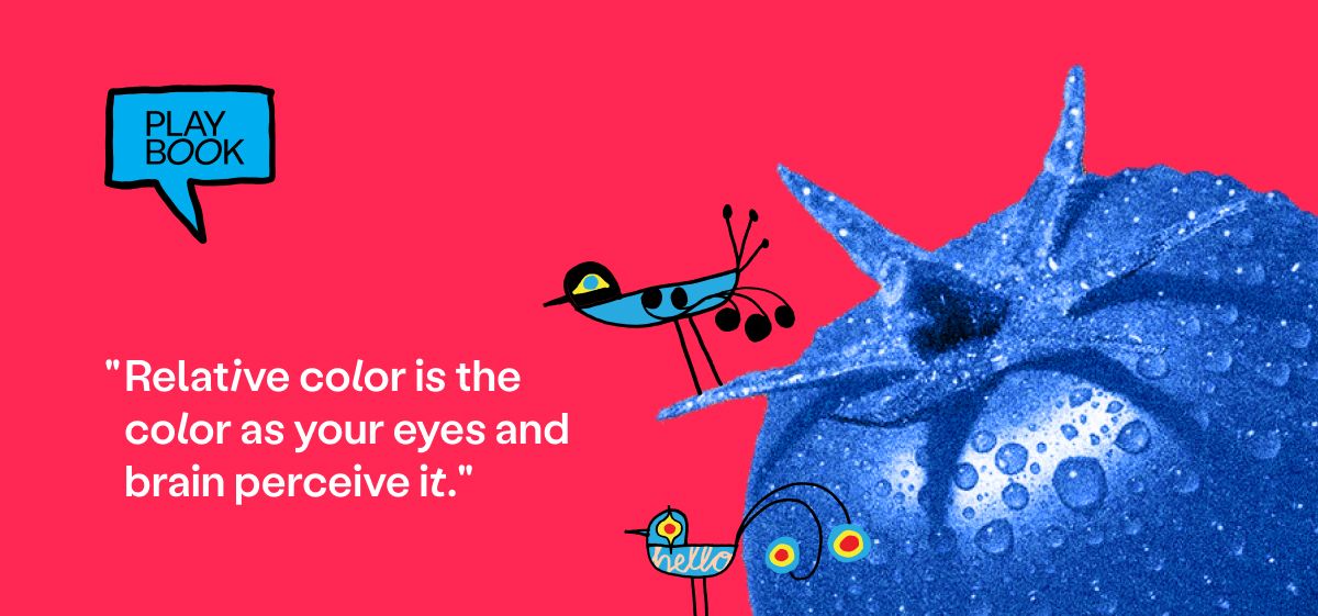
Relative color is the color as your eyes and brain perceive it. The way we see relative colors is usually influenced by the other colors surrounding it and the context we view it in. For example, if you look carefully at a painting of a cityscape at sunset, you may notice the artist has used deep blue and purple hues to create the shadows that your brain perceives as dark.
Most of the time, we see colors as relative because very few objects or images are composed of just one color. However, the surrounding colors can confuse your eyes and cause you to misjudge the true value of the color — which is why, as a graphic designer, you need to learn how to work with absolute colors.
Absolute colors
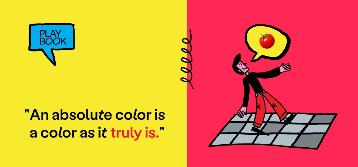
An absolute color is a color as it truly is rather than how you perceive it. It’s the one you would observe by color picking, or visually isolating the colors to minimize their influence on your perception.
There are a few different ways to classify absolute colors:
- Hexidecimal values: these are the codes many designers use to isolate specific absolute colors. For example, #FF0000 represents pure red.
- RGB values: this is a way to define colors using red, green, and blue values on a scale from 0 to 255.
- CMYK values: mostly used for printing to ensure color consistency, CMYK stands for cyan, magenta, yellow, and black.
- Pantone colors: the Pantone Matching System (PMS) is another color classification system commonly used in printing.
In graphic design, understanding the difference between relative and absolute color can help you make informed decisions about color palettes, contrast, and composition, so you can create more impactful designs.
How to use relative and absolute color in graphic design
When and how you use relative and absolute colors in your designs will depend on what you’re trying to achieve or communicate with the image.
You probably already do this, even if only instinctively. Most designers use cool, dark colors to represent shadows that add depth or realism to a design while favoring bright, bold colors to highlight the areas they want the viewer to pay attention to.
By understanding how colors interact with each other, you can use relative color to create contrast, balance, depth, realism, harmony, or meaning in your designs. For example, by gradually shifting from more to less intense color values, you can create the illusion of depth. Alternatively, you might use relative colors to invoke a mood or atmosphere, such as reds, oranges, and yellows to create a cozy atmosphere.
You should also consider the context in which people will view your design and how that may affect the way they perceive the colors. For example, the same design may look totally different when printed from how it looks on the computer, so you’ll need to bear this in mind when choosing colors to put next to each other.
Understanding how relative color works in design is essential for aspiring graphic designers to create effective and impactful designs, so the sooner you can master it, the better.
But what about absolute color?
Like relative colors, absolute colors help you create designs that are both visually appealing and communicate the intended message. For instance, absolute colors are a popular choice in logo design because designers use color psychology to transmit the desired brand identity. So a sustainable food production company might opt for a green logo to symbolize its contribution to solving the planet’s environmental challenges.
Using absolute color values like the ones listed above helps you ensure coherence in your designs across all media — particularly print media, which can distort colors depending on the type of ink or paper. Use tools such as color calibration and color profiles to ensure the colors in your designs are accurate and consistent in all formats.
Colors speak all the languages
Getting to grips with the use of relative and absolute color is one of the fundamentals of good graphic design. It will help you communicate messages, evoke emotions, create clear visual hierarchies, and establish brand identities your clients will love.
Looking for more resources for beginner designers? Check out our ultimate guide to using space as an element of design.