

For the crew of the Starship Enterprise, space was the final frontier. For designers, it’s one of the most basic elements of design and a fundamental principle that all successful designers must master.
So it’s kind of the first frontier.
Every design starts with a blank page — a space to be filled where the only limit is your imagination.
But once you begin adding design elements, how you use that space can make the difference between an impactful design and one that fails to hit the mark.
At a basic level, ‘space’ refers to the areas around, between, and within design elements. The effective use of space in graphic design can help create visual balance, hierarchy, and interest, as well as improve readability, usability, and even accessibility.
By carefully considering the placement of elements and the relationships between them within a design, designers can create compositions that are unique, memorable, beautiful, and effective at communicating their intended message.
There are various types of space in design, and how you use them can alter the mood, evoke an emotion, or guide the viewer’s gaze.
In this ultimate guide to using space effectively in graphic design, we’ll explore the different types of space, principles and techniques for using space effectively, and best-in-class examples of the use of space in design.
Let’s get started.
Types of space in graphic design
Space in graphic design can take on many different forms and functions, and understanding these different types of space can help you make more informed decisions about how to use them in your designs.
Let’s take a look at some of the most common types of space graphic designers use.
Positive space: the objects or elements in a design
Positive space refers to the parts of a design that are occupied by elements such as text, shapes, figures, objects, images, or colors.
These elements form both the main focus of the design and any background elements that help draw attention to the main focal point.
Designers use positive space in a variety of ways to create emphasis, hierarchy, and interest (more on these later).
Negative space: the space around and between objects or elements
Negative space refers to the areas around and between the positive space elements. It can help create balance and visual interest while making a design cohesive and aesthetically pleasing.
Without negative space, designs can quickly become confusing and overwhelming, and the viewer doesn’t know where to focus or what the main message is.
That’s why negative space is just as important in design as positive space, and how you use it can make all the difference.
For example, you can use negative space to create a sense of openness and airiness or direct the viewer’s attention to where you want it to go.
In some designs, the negative space becomes the focal point, with the positive space framing the negative space to create the image, as with the Obey logo.
The positive shapes here are the solid black areas, while the negative space between them forms the image of a face.

Active space: the space that engages the viewer
Active space is the space that draws attention to or highlights the main elements of the design.
Active space can be both positive and negative. Designers create active space through their use of color, contrast, organic shapes, or movement.
Active negative space (or white space) is the negative space between design elements or text blocks.
Use active space to create hierarchy, structure, emphasis, drama, and interest in a design.
Passive space: the space that balances the design
Passive space is the more subtle space that exists naturally within your design. For example, the space between letters, lines, and paragraphs in a text is passive space — but that doesn’t mean you can’t work with it.
Like active space, passive space can create structure, balance the composition, provide visual stability, and guide the eye — but in a more nuanced way.
Stretching or compressing your passive space can be just as impactful as working with the other types of space — so don’t let the name fool you!
You can use passive space to convey a sense of calm and rest or provide a visual break for the viewer.
Passive space is also essential for creating vertical rhythm, which is the use of space in typography design.
Principles of design: how to work with space
Now that you’re familiar with the types of space in graphic design, it’s time to learn how to work with them to create cohesive, impactful designs that impress your clients and wow your viewers.
Here are four of the fundamental principles to start working with space. Use them to create compositions that are well-balanced, cohesive, and visually appealing.
Proximity: grouping related elements together
Proximity refers to the distance between elements in relation to each other. Use proximity to group related objects together to create a sense of organization and hierarchy.
Placing related elements close to each other creates a sense of unity, while placing them further apart can also provide clues about the relationship between them or create direction and flow in the design.
Alignment: aligning elements with each other or a grid
Alignment refers to the way elements line up with each other. You can use alignment to create structure, balance, cohesion, or contrast in your designs.
For example, by aligning certain elements along a common axis or grid, you can create a sense of unity between them or indicate the order in which to read or look at each element.
Deliberately misaligning elements can have the opposite effect and create a sense of contrast or opposition which can communicate the message in a different way.
Repetition: repeating elements or design motifs to create cohesiveness
Repetition involves using the same or similar elements, colors, shapes, typography, or images throughout a design.
Think about a brand you admire — it probably maintains brand consistency through a set color palette, a handful of branded images, and two or three typefaces in most of its designs.
Its use of repetition makes its designs memorable and contributes to the brand image.
Through the repetition of elements such as color, shape, or texture, you can create a sense of unity and reinforce the message of your design.

Contrast: using different types or sizes of space to create visual interest
Contrast is the use of opposite or strikingly different elements in combination, for example, by juxtaposing large or small areas of positive and negative space or using color contrasts to create emphasis.
Contrast informs the viewer about what is most important in the design and helps them focus on the most critical information and elements by highlighting them.
Top techniques to use space effectively in graphic design
Ready to put your knowledge of space into action? Here are some space design techniques you can use to create different visual effects.
White space: using negative space to create a clean and uncluttered design
The effective use of white space can create a clean and spacious look. Think about just about every Apple ad you’ve ever seen — they use tons of empty space to create a minimalist aesthetic with a luxurious feel to it.

But white space isn’t just about aesthetics. It also improves readability and makes your designs more accessible and easier to digest.
By leaving plenty of negative space around and between elements, you can create a sense of openness and simplicity, which can be particularly effective in modern and minimalist design styles.
Trapped white space: negative space enclosed by other elements
Trapped white space is negative space that is surrounded or enclosed by other elements and can make a design feel cluttered or difficult to read.
Although it can be used as an element in the design (see our examples below), in most cases, it’s something you’ll want to avoid.
This is because trapped white space draws attention to itself and away from the main visual elements or concepts of the design.
To avoid trapped white space, look for ways to separate the design elements so that the white space can ‘flow’ and use shapes and forms that allow for fluid negative space.
Additionally, avoid placing elements too close to the edges of the design, as this can leave you with space you can’t use.
Cropping: using positive space to draw attention to a specific element
You’re probably familiar with cropping — we’ve all used the “crop” function on our phones to get that selfie just right before posting it on social media.
Cropping is the process of removing unwanted areas from around the edges of a design element. It’s a way to “zoom in” on what matters and create a visual focal point.
Use cropping to forge a sense of intimacy and highlight the main elements of your design.
Overlapping: using positive and negative space to create depth and hierarchy
Overlapping means placing elements on top of or in front of each other. It can help create a visual hierarchy and a sense of depth and dimension.
Overlapping can help give the impression of looking at a three-dimensional image while emphasizing the core elements.
Layering: using positive and negative space to create complexity and depth
Layering involves using multiple levels of positive and negative space to create a sense of complexity and depth and can add visual interest to a design.
Like overlapping, layering creates depth and dimension, but in a slightly different way.
Vertical rhythm: using typography design to improve legibility
Vertical rhythm refers to the use of space in typography design. It’s crucial in web design and any other type of design that involves working with blocks of text.
The premise of vertical rhythm is simple: it’s all about ensuring that the spaces between elements such as headers, text blocks, and pull quotes are evenly distributed in a way that makes the text easy to read.
Varying the spacing between and around text can also create hierarchy or draw attention to specific elements.
Pull up an empty page and start playing around with these techniques to master them and discover new, creative ways to use them.

5 top examples of effective use of space in graphic design
Now we’ve covered the main uses of space in design, let’s look at some examples of working with space to create interest, guide the viewer’s eye, and create the illusion of depth and dimension.
Use these examples to inspire your own designs as you get to grips with working with space.
1. The Xbox logo(s)
The Xbox console logos have always used a variety of design techniques to create the image of a three-dimensional ball with the iconic ‘X’ embedded in it.
For example, the Xbox One logo uses color, contrast, and the off-center alignment of the X to create the illusion of a sphere with a profound green chasm.
The shading around and within the edges of the ball makes it practically jump off the screen.

2. The Kung Fu Panda movie poster
The Kung Fu Panda movie poster employs several of the techniques outlined above to create the illusion of a 3D image in which the cast of characters appears to be moving toward you.
These include color contrast, shading, layering, overlapping, and the use of white space around the protagonists that make them the main focal point of the image.
It also uses proximity and alignment to indicate the centrality of each character to the movie plot. The main characters are closer to the center of the image, while the secondary characters are slightly further away.

3. The New York Times Magazine
This edition of New York Times Magazine is a masterclass in the use of space in design. The back of the Cadillac is in full focus, while the shaded area and tire marks underneath it create a sense of movement away from the viewer while emphasizing the length of the car.
Above the photo, the designer used white space, passive space, and vertical rhythm to grab the reader’s attention and create intrigue, drawing the eye down the page from the text to the car.

4. The FedEx logo
The FedEx logo is deceptively simple — at first glance, it might just look like the company’s name on a white background.
But look closely, and you’ll spot one of the most subtle and clever uses of negative space in the world of logo design.
Some people take years to notice it — usually when someone points it out to them — but once you see it, you won’t be able to unsee it.
The positioning of the “E” and the “X” forms a trapped white space in the shape of an arrow — representing the company’s ability to transport goods from one place to another quickly and reliably.

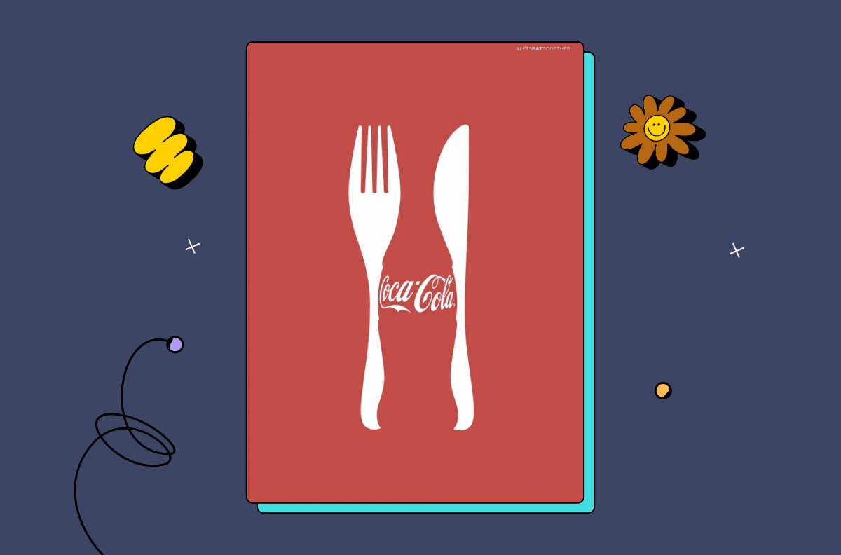
5. Coca-Cola: Let’s Eat Together
In its “Let’s Eat Together” campaign, Coca-Cola also works with negative space and trapped white space to create the illusion of a bottle in between a knife and fork.
The positive space in this image is the background, while the silverware and Coca-Cola logo are actually formed of trapped white space.
Clever, huh?
6 tips for working with space in graphic design
Now it’s your turn to put everything you’ve learned to use and start incorporating space as an element of design into your work. These six tips will help you get started.
1. Use positive space to create emphasis
Make the positive space larger or more prominent than the negative space to draw attention to and emphasize the core elements of the design.
As we’ve seen in the examples above, the positive space can be the main focus of the design, or it can be the form that contains the negative space to create shapes, objects, and even text.
The possibilities for working with positive space are endless. Play around with size, color, layering, shading, and other design techniques to create emphasis in your designs.
2. Use negative space to create balance
Balancing positive and negative space is essential in design. Whether you have one central focal point or a busy design bursting with positive space elements, negative space is what will hold it all together.
Use negative space to balance out a large positive space, or use positive space to counterbalance a dominant negative space.
3. Use negative space to guide the viewer’s eye
Use negative space to create a path or directional flow that guides the viewer’s gaze toward a particular part of the design.
You can do this using lines, shapes, or other design elements that draw the eye towards the design’s central features and lead the viewer on a ‘journey’ across the page.
4. Add depth and dimension to both positive and negative space
Gradients, shading, and other techniques can create the illusion of three-dimensional space and add depth and dimension to a design.
For example, a commonly-used shading technique is drop-shading. This technique forms subtle shadows around a design element and can be used to create negative space that helps each element stand out from the others. Drop-shading is commonly used in web design, product design, and app design.
5. Consider the relationship between positive and negative space
The interplay between positive and negative space can change the look and feel of a design.
Therefore, it’s important to carefully consider the relationship between positive and negative space to create aesthetically pleasing compositions while conveying the desired message.

6. Use baseline grids, margins, and leading
To create vertical rhythm in typography design, start by creating a baseline grid — a series of horizontal lines set at even intervals. This establishes the line height, which in turn dictates the typeface and font size to use.
Once you have your baseline grid, it serves as the foundation for your margins and leading. Margins are the spaces at the top and bottom of the page and around text blocks, while the leading is the space between lines of text.
Adhering to the baseline grid, margins, and leading can create a sense of cohesion and harmony in your design. You can also play around with them to emphasize a particular focal point.
For example, if you want a block of text (such as a pull quote) to stand out, you could increase the text size, leading, and margins around it.
Give your space the space it deserves
The Enterprise’s mission may have been to explore strange new worlds, but as a designer, space will be the medium you use to create new worlds.
Whether you want your design to evoke passion, calm, trustworthiness, excitement, scarcity, or desire, an effective use of space will help you achieve it.
If you want a minimalist design, use lots of negative space. For a maximalist design, fill the canvas with positive space and balance it out with negative space.
When it comes to working with space in design, keep the following tips in mind, and you won’t go too far wrong:
- Experiment with different types and sizes of space to see what works best for each design.
- Pay attention to the balance between positive and negative space.
- Consider the composition and how the use of space affects the hierarchy and readability of your design.
Once you’ve mastered the art of working with space in your designs, you’re going to need a different type of ‘space’ to save, organize, and share all your amazing projects.
That’s where Playbook comes in.
Playbook is a visual storage system created by designers for designers and tailored to the needs of creatives.
With impressive storage capacity, a visually inspiring layout, and tools for organizing, collaborating on, and sharing digital assets, Playbook is the perfect place to store your designs.
Sign up for a free account and receive 4TB of lifetime storage — all the space you’ll ever need.