

To become a successful graphic designer, you’ll need to master the art of using positive and negative space in your designs.
Positive space is the area of a design or work of art containing a design element, such as shapes, figures, objects, or text. It is the focus of attention and is often what the viewer perceives as the subject of the design.
Negative space, on the other hand, is the empty or open area surrounding and between the positive spaces. It’s the space that’s not occupied by the elements used in the design.
However, in some cases, negative space can be used to add elements to the design, as we’ll see later on.
Understanding positive and negative space and how to use them effectively is an essential skill for a graphic designer as it helps create emphasis, balance, visual interest, and a pleasing aesthetic.
This article will cover why positive and negative space matter in design, examples and use cases of positive and negative space, and tips for working with positive and negative space in your designs.
Importance of positive and negative space in graphic design
In a well-balanced design, the untrained eye won’t even notice the positive and negative space. But get them wrong, and your image will seem a little off — even to the uninitiated.
Here are four reasons why striking the perfect balance between positive and negative space is important in graphic design.

Rhythm
Positive and negative space create a sense of rhythm and movement through patterns and repetitions.
Alternate between positive and negative space in your designs to convey a mood, emotion, atmosphere, or message.
Balance
Negative space balances out positive space so that a visual piece doesn’t seem overwhelming.
Positive space is where the busy action is, while the negative space is a quiet area. The use of negative space creates harmony and cohesion in your design.
Focus
A work of art doesn’t need to be busy to be effective — a composition with lots of negative space can be simpler — and, in some cases, more impactful — than one filled with positive space.
In many designs, the negative space allows the viewer to quickly identify and interpret the focal point.
Dimension
When creating three-dimensional drawings or paintings on a two-dimensional surface, negative space around the main subject adds dimension, making elements appear to jump out of the page.
How graphic designers use positive and negative space
Here are three of the most common ways designers use positive and negative space in graphic design.
Silhouettes
Have you ever seen the image of a silhouette of a person (or sometimes an animal) standing in front of a full moon?
The person’s outline is the positive space, while the empty space around and between the silhouette is the negative space.
In this example, the design is mostly negative space, which helps to define and give shape to the positive space, and create balance and visual interest in the overall design.
The negative space — i.e., the moon — also evokes a dreamy, mystical, and peaceful atmosphere.
Creating emphasis
Positive space can also be used to draw attention to specific elements in a design. For example, a designer might use a large, bold font or bright color to make part of the image stand out from the overall composition.
The use of negative space can help to balance this emphasis and prevent the viewer from being overwhelmed.
Guiding the viewer’s eye
You can also use negative space to lead the viewer’s eye to specific areas of interest in a design.
For example, a designer might use negative space to create a path or directional flow that guides the viewer’s gaze toward a particular part of the design.
Examples of positive and negative space in design
Now let’s take a look at some real-world examples of designs that use positive and negative space to create images that are memorable and purposeful.
Obey
Obey is a popular streetwear brand with an iconic positive and negative space logo. If it looks familiar, it might be because you’ve seen other work from the artist behind it.
That’s right, American contemporary artist Shepard Fairey is the founder of Obey clothing. The logo design originated from his “Andre the Giant Has a Posse” sticker campaign.
The positive shapes here are the solid black areas, while the negative space between them forms the image of a face.

WWF
The World Wildlife Fund’s logo communicates the purpose of the company through its great use of positive and negative space.
The panda logo originated in 1958 and captures an endangered species through cleverly placed black and white shapes.
The logo is simple and doesn’t try to portray every intricate detail of a panda.
Instead, the artist chooses to highlight the most recognizable areas in black and use the white area around them to create an illusion of a complete image.

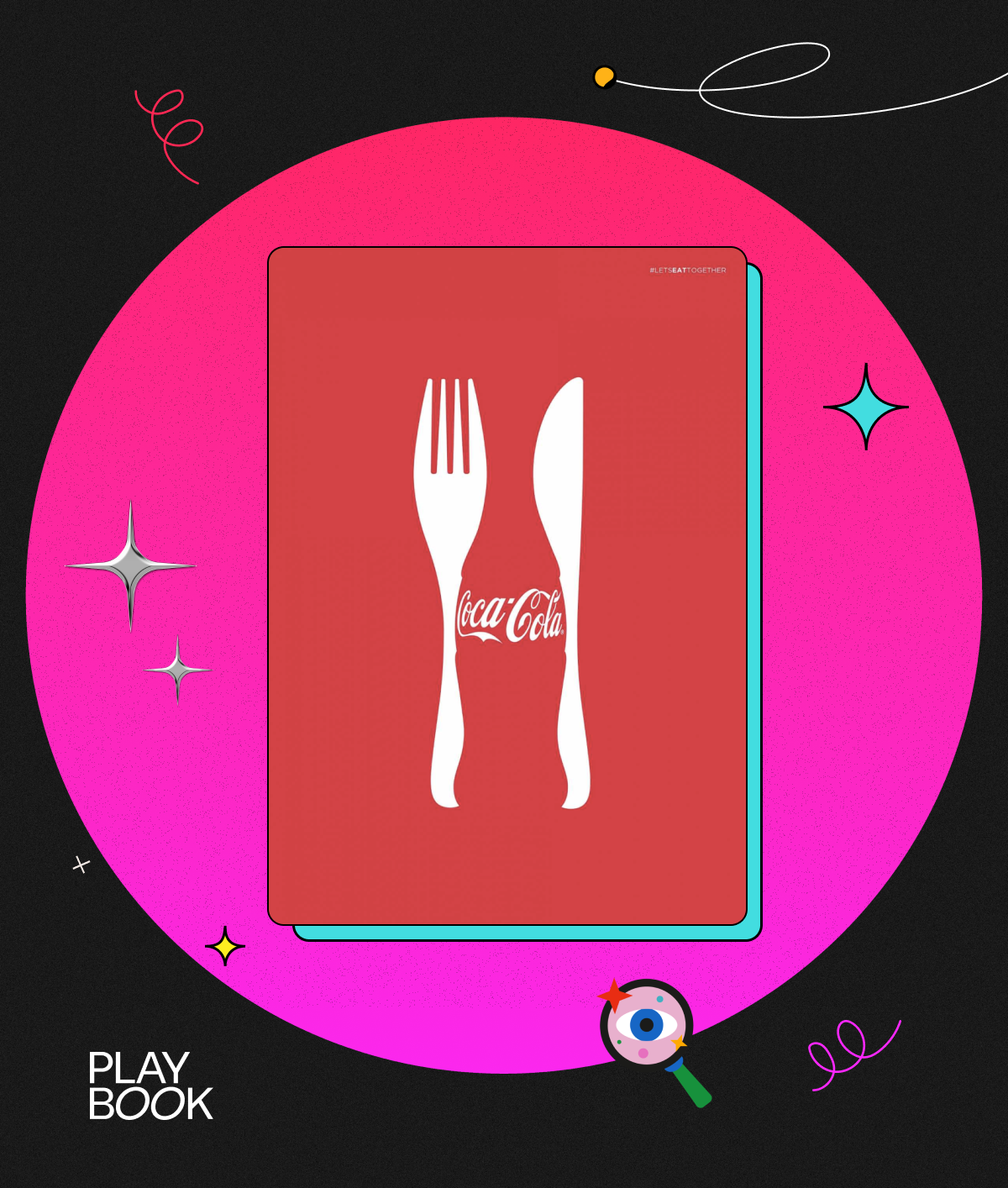
Coca-Cola: Let’s Eat Together
In its “Let’s Eat Together” campaign, Coca-Cola relies on a precise balance of space to create an optical illusion of a bottle in between silverware.
Look closely enough, and you’ll realize that there’s not actually a bottle there — just some well-placed positive and negative space.
The positive space, in this case, is the silverware and the Coca-Cola logo. It’s an excellent example of how positive space art can communicate complicated ideas through simple design.
FedEx
FedEx has one of the most iconic uses of negative shapes in the history of logo design.
You may not have noticed the cleverly hidden message at first glance, but once you see it, you won’t be able to forget about it.
If you look closely between the letters of the logo, you’ll notice a shape of an arrow created through the brilliant use of negative space between the “E” and the “X.”
The presence of the arrow in the logo reflects the overall message of the brand. The arrow signifies the fast and safe delivery of packages from origin to destination.

Tips for using positive and negative space in graphic design effectively
The best way to learn how to use positive and negative space effectively is to practice, practice, and practice some more.
Create designs for fun and experiment with using positive and negative space. If you design something you love, you can even add it to your graphic design portfolio.
Here are some of our top tips for working with positive and negative space.
Use positive space to create emphasis
Make the positive space larger or more prominent than the negative space to draw the viewer’s attention and create emphasis.
You can achieve this through the use of size, color, contrast, or other design elements or techniques that make the positive space stand out from the negative space.
Use negative space to create balance
Balancing positive and negative space is essential for creating visual interest and a sense of harmony in a design.
Try using negative space to balance out a large positive space or positive space to counterbalance a dominant negative space.
This can help to create a sense of equilibrium and make the design more visually appealing.
Use negative space to lead the viewer’s eye
Use negative space to create a path or directional flow that guides the viewer’s gaze toward a particular part of the design.
You can do this through the use of lines, shapes, or other design elements that draw the eye toward the positive space.
Use positive and negative space to add depth and dimension
Use gradients, shading, and other techniques to create the illusion of three-dimensional space and add depth and dimension to a design.
Consider the relationship between positive and negative space
The interplay between positive and negative space can significantly impact the overall look and feel of a design.
Carefully consider the relationship between positive and negative space to create compositions that are aesthetically pleasing and effective in conveying the desired message.
Use positive and negative space to create more impactful designs
If you’re wondering how to make your designs more meaningful and memorable, try playing around with positive and negative space.
The relationship between these two types of space can make the difference between an okay design and one that really works — making it an essential component of visual design, including graphic design, art, and architecture.
Understanding and effectively using positive and negative space can help you create visually appealing, engaging, and impactful designs that convey a powerful message.
For a more in-depth look at working with negative space in design, check out our article on how to work around trapped white spaces in graphic design.
Interested in the full package? Our 'Ultimate Guide to Using Space in Graphic Design' has you covered. From clear explanations to real-world examples, this is the one resource you'll need to take your understanding of space to the next level. Hit the button below to go right to it.