
Vertical rhythm is a technique typographers use to create vertical space on a page between lines and blocks of text. It’s an especially crucial aspect of web design and web typography as it affects a website’s readability.
Readability performs an essential function on a website — it makes the information easy to scan and digest, which can keep people lingering on a site and reading about a business, product, or service. It can even make them more likely to share it with others.
Whether or not you’re a typographer (or aspire to be one), learning about vertical rhythm is a great way to deepen your understanding of the importance and use of space in design.
Spacing is a fundamental element of all design that improves legibility and adds aesthetic appeal, draws the viewer's attention to the main element or message, and increases a design's overall effectiveness.
Proper spacing guides the reader’s eye and creates a sense of balance and harmony on the page.
This article will walk you through the basics of vertical rhythm, three of its benefits, and some tips for creating vertical rhythm in your designs.
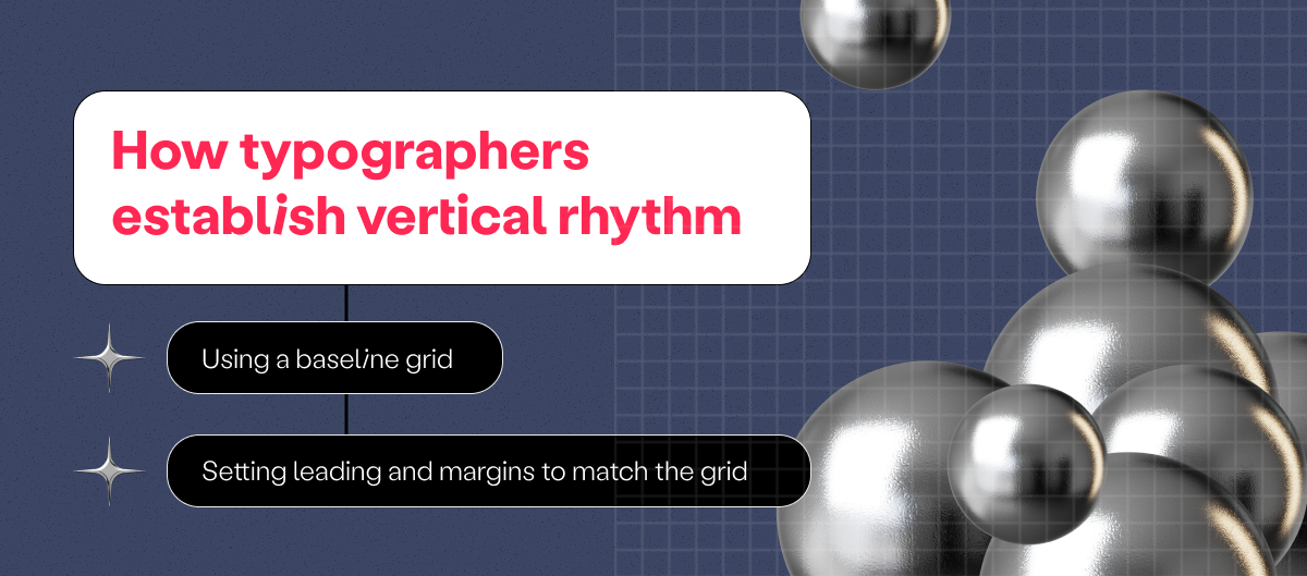
How typographers establish vertical rhythm
Vertical rhythm design has two main aspects: the baseline grid and the margins. Let’s take a look at how typographers use them.
Using a baseline grid
A baseline grid is a series of horizontal lines spaced at regular intervals to create a vertical grid. The baseline grid establishes the base line-height, which in turn dictates the base font size.
Thus, the baseline grid serves as a foundation for the vertical rhythm of the page and helps to ensure that all elements are aligned and spaced consistently. It is also a guide for setting the leading and margins of text blocks and other elements on the page.
Setting leading and margins to match the grid
The leading is the space between lines of text, and the margins are the spaces around text blocks and at the top and bottom of the page. To create a consistent vertical rhythm, typographers match the leading and margins to the intervals of the baseline grid.
For example, if the baseline grid is set to have a line every eight pixels, the designer might set the leading of the body text to eight pixels and the top and bottom margins of a block of text to eight pixels. By adhering to the grid, the designer can create a harmonious, cohesive design.
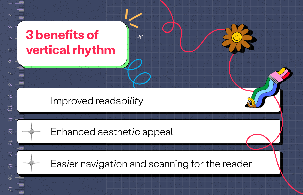
3 benefits of good vertical rhythm
1. Improved readability
Consistent, well-thought-out vertical rhythm can improve the readability of a text by making it easier for the reader to find the information they need.
When the spacing between lines is too small, it can make the text feel cramped and difficult to read, while too much white space can cause the text to feel disconnected and hard to follow.
By contrast, consistent spacing between lines and blocks of text helps to guide the eye and reduce eye strain.
2. Enhanced aesthetic appeal
In addition to improving readability, an effective vertical rhythm can also enhance the overall aesthetic appeal of a design. Consistent spacing creates a sense of order and balance, making the design more visually appealing.
When elements on the page are spaced unevenly or at random, it creates a sense of chaos and visual clutter that distracts the reader. By setting the vertical rhythm, the designer can create visual harmony that motivates the viewer to keep reading.
3. Easier navigation and scanning for the reader
When you go to a website looking for a specific piece of information, what do you do? Most people will start by scanning the page to establish whether what they’re looking for is there or not.
If the spacing between elements is inconsistent, it makes it difficult for the reader to know where to focus their attention, leading to confusion, frustration, and bouncing off the website in a matter of seconds.
Orderly vertical spacing creates a hierarchy of content that guides the reader’s eye, making it easier to scan for the most relevant information and navigate the page. It can also improve accessibility for visually impaired viewers.
In the hierarchy, the most important elements have more space around them, and the less critical elements have less space around them. This use of space enables the designer to guide the viewer to the information they need.
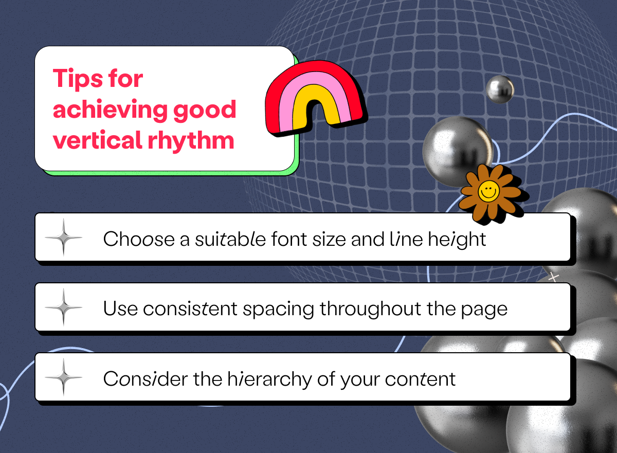
Tips for achieving good vertical rhythm
Ready to start using vertical rhythm in your typography designs? Here are three tips to get you started.
1. Choose a suitable font size and line height
Choosing a font size and line height that are appropriate for the design and audience is crucial for achieving a good vertical rhythm.
The text size should be large enough to be easily readable but not so large that it takes up too much space on the page. The font size you choose will depend on what typeface you’re using, as some are larger than others.
The line height and leading should also be like Goldilocks’s porridge — “just right.” If your lines are too close together, the text will feel cramped and difficult to read, but too much space will make the text feel disconnected and hard to follow.
2. Use consistent spacing throughout the page
Maintaining consistent spacing between elements throughout the page is key to creating a cohesive and harmonious design.
This means using the same leading and margins for all text blocks and the same amount of space between other elements, such as images.
Of course, if you want to draw attention to specific elements or minimize the importance of others in the hierarchy, you can change the spacing to create those effects.
3. Consider the hierarchy of your content
Speaking of hierarchy, this is one aspect you’ll need to consider as you create your vertical rhythm. Significant elements you want to highlight should have more space around them, while elements further down the hierarchy can have less space.
This helps to create a clear hierarchy for the reader, making it easier for them to scan and understand the content.
For example, a headline might have more space above and below it than a body paragraph to indicate that it’s more important. Or a block quote might have more space around it to highlight the information it contains.
Master vertical rhythm to create more effective designs
When you master the art of vertical rhythm in design, it becomes easier to create web pages and other documents that are aesthetically pleasing, easy to read, and effective at communicating the desired message.
Finding the right balance of spacing and learning to establish hierarchy can take some experimentation, but it’s worth the effort to create a cohesive and effective design — and become a better designer.
Play around with vertical rhythm by using different combinations of font size, line height, and margins to find the best spacing for a particular project.
If you’re looking for more typography resources, check out our complete guide to typography design.
Interested in the full package? Our 'Ultimate Guide to Using Space in Graphic Design' has you covered. From clear explanations to real-world examples, this is the one resource you'll need to take your understanding of space to the next level. Hit the button below to go right to it.