
Graphic design is all about using space — you start with a blank canvas, then use the interplay between the design elements and the space to create an aesthetic, evoke an emotion, or convey a message. In essence, the way you use space can make or break your masterpiece.
Empty space in your design is known as white space or negative space. Despite the name, negative space isn’t inherently bad — for example, in web design, a white background can make it easier to scan text on a page, improving readability and legibility.
In graphic design, white space is not just the absence of elements; it's a powerful element in itself. Using white space can help you create a particular mood or establish a visual hierarchy, drawing the viewer’s eye to the main focal points. It can also create balance within your design and influence the overall impact of your creation, making it an integral part of visual design.
Types of white space
Now, let's explore the various forms of white space:
Active space vs. passive space
Active space is intentional and purposeful. It's the deliberate use of white space to highlight a focal point or create emphasis on specific parts of the design, and it can be used to create shapes, patterns, and negative space effects. Some notable uses of active white space include die-cut shapes in print materials and the use of negative space in icon or logo design.
On the other hand, passive white space is the natural or incidental white space that occurs around elements; it doesn't draw attention to itself. Passive space helps to improve readability and visual hierarchy, and examples include the space between paragraphs and the margins around a website layout.
Macro white space vs. micro white space
Macro white space refers to the larger areas of empty space within a design. It can separate different content sections, highlight elements, and create a sense of balance and visual breathing room. Great examples of macro white space include margins, gutters, and the space around images and other visuals like CTA buttons.
Micro white space addresses the finer details — for example, the subtle spacing between individual letters, words, lines, and objects, or the distance between paragraphs. Micro white space affects the overall legibility and readability of the text, and misusing it can lead to crowded and difficult-to-read content.
Benefits of using white space in graphic design
As we’ve discovered, white space isn't just a void waiting to be filled; it's a crucial design element that offers numerous advantages:
- Separation and grouping: White space is a visual separator, distinguishing between elements and creating coherence within your design. It's essentially the buffer that prevents visual clutter and chaos. Imagine trying to read a book with no space between the lines or words. It would be a frustrating and eye-straining experience, right? White space provides breathing room for your text, making it easier to read and comprehend.
- Hierarchy building: You can establish hierarchy within your content by strategically employing white space. While larger gaps can signal importance, drawing the eye to specific elements or the most important messages, smaller ones guide the viewer's progression through your design.
- Distinctive aesthetics: White space can be a powerful tool for giving your design a personality. Using generous amounts of white space can convey a sense of sophistication, minimalism, and elegance. Alternatively, using less white space can create a more playful and dynamic feel.
- Increased balance and harmony: White space is like the glue that holds a design together. It helps to develop a sense of balance and proportion, preventing the design from feeling heavy or overwhelming. Just like a room needs empty space to feel spacious, a design needs white space to breathe and feel visually harmonious.
- Improved user experience: White space can make a design or text more inviting and user-friendly. For instance, it allows users to scan information easily, find what they're looking for quickly, and avoid feeling overwhelmed when using a website or app. This ultimately leads to a better user experience and can even improve conversion rates.
What is trapped white space?
While white space is a significant element of effective design, trapped white space is something you generally want to avoid.
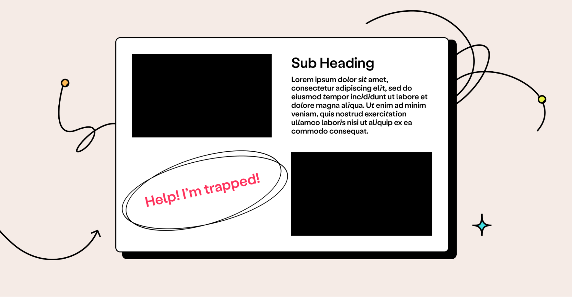
Trapped white space refers to small areas of negative space surrounded by other elements and not easily accessible for design or layout purposes.
Instead of enhancing your design, trapped white space interrupts its natural flow and directs your viewer's focus toward the empty space, diverting attention from the meticulously chosen and thoughtfully positioned design elements.
This poses several problems for a designer: it can make it challenging to align elements or make layout changes without disrupting the overall design. Moreover, accessing the trapped space can be difficult, impeding the cohesiveness of your creative work.
Avoiding trapped space is essential for creating a visually appealing and effective design. In the following sections, we'll walk through techniques you can use to free trapped white space and offer tips to prevent this design problem in the future.
How to work around trapped white spaces in graphic design
Trapped white spaces can throw a spanner in the works for a graphic designer, but if you find yourself with trapped white space in your design, don’t panic!
You don’t have to do your entire design over — try some of these simple steps to deal with trapped white space effectively.
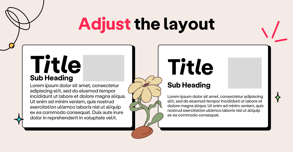
Adjust the layout
One solution to trapped white space is to adjust the design layout to create more space or to allow for better alignment.
For instance, you could change the size or position of elements — such as text boxes or images — add or remove elements from the design or separate elements to free the white space and enable it to flow.
If there is trapped white space between two closely spaced text boxes, for example, you could play around with the font size or line spacing to create more space. Alternatively, you could move one of the text boxes to a different location in the layout.
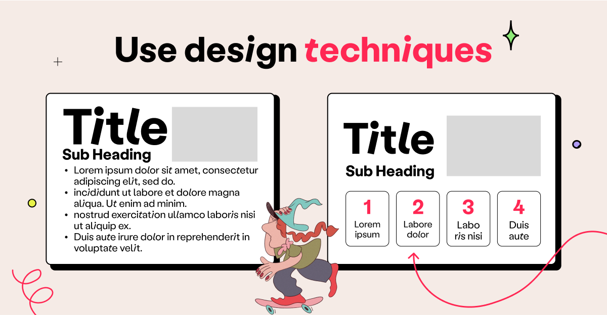
Use design techniques
There are various design techniques that you can use to free trapped white space and create a more cohesive image.
For example, hierarchy and contrast can spark visual interest and guide the viewer’s eye. You can create hierarchy by changing the size of design elements, overlapping elements so that the most important ones are in front, or using color contrast to highlight particular elements.
On the other hand, you can look for ways to turn your trapped white space into negative space that actually makes your design work better. For example, if you have trapped white space in the corner of a design, look for ways to turn it into negative space that creates visual balance and draws the viewer’s attention to the desired area.
Use design software
Some design software programs — such as Adobe Illustrator — have features that allow you to eliminate trapped white space easily.
For example, use the “Align” tool to align elements and create more space or the “Pathfinder” tool to merge or divide shapes and create more design flexibility.
Using these tools can help you make precise adjustments to the layout that remove unnecessary trapped white space.
Be creative
Sometimes, the best solution might be to throw tried-and-tested techniques out the window, go rogue, and devise a creative solution to the problem.
This might involve using a different design approach or finding a new way to present the information. For instance, if you have trapped white space between two images, you could try using a creative frame or border to make the white space more visually appealing and to better integrate it into the overall design.
Be willing to try new ideas and experiment with different approaches to find a solution that works for your design.
How to prevent trapped white space in your graphic designs
Prevention is better than cure, as the saying goes, so how can you avoid ending up with trapped white space in the first place? There are a few steps you can take to make sure you fill the canvas every time.
Plan ahead
Ever heard the expression, “Fail to plan, plan to fail?” It applies to design, too. Consider the layout and placement of all the elements you intend to use before starting the design process.
This can help you avoid trapped white space and make it easier to modify your design later on.
Use guides and grids
Guides and grids can help you create a balanced layout and ensure you align all elements in a way that’s both visually appealing and achieves the objective of the design.
Knowing what will go in each space of the grid can help prevent trapped white space from occurring.
Keep an eye on negative space
The most straightforward way to prevent trapped white space is to be mindful of the empty areas of your design as you create it.
Be just as aware of the negative space as you are of the other elements and use it to add emphasis in all the right places. This will help you ensure you don’t box it in and turn it into trapped white space.
Free the trapped white space for more impactful designs
As you build your design skills, working with white space will start to come more easily to you. Mastering design techniques — like the ones outlined in this article — will help you navigate avoidable pitfalls such as trapped white space.
And remember, you're not alone on this creative journey. A vibrant community of designers can help you along the way, providing insights, feedback, and support. At Playbook, we offer such a community where you can connect with fellow designers, share experiences, and grow together. Don't forget to check out our excellent design templates to get some inspiration for your portfolio.

We also offer resources and tips on the technical aspects of graphic design, like this article on how to create depth in graphic design. Interested in the full package? Our 'Ultimate guide to using space in graphic design' has you covered.
From clear explanations to real-world examples, this is the one resource you'll need to take your understanding of space to the next level. Hit the button below to go right to it.